7 Best SaaS Websites That Nailed SEO and Design [2023]
The best SaaS websites are built to market your product features, educate visitors on its core benefits, and convert them into customers and free trial users.
But to attract customers and drive conversions, your SaaS website must have two qualities (apart from great content).
- SEO – SaaS SEO ensures your website gets organic search traffic for your target keywords.
- Website: Your SaaS website’s user interface, colors, and design elements are vital in driving conversions.
When you get your SaaS website’s messaging, SEO, and design right, magic happens.
In this article, I’ll show you some of the best SaaS website examples that drive insane traffic and conversions by nailing SEO and design.
Let’s dive in.
Best SaaS Website Examples With Excellent SEO And Design
Balancing SEO and design in a SaaS website while effectively communicating your core features and benefits is challenging.
Some SaaS websites might seem too simple to you, but they’re often a result of extensive audience research, testing, and optimization. Because the goal is to attract relevant traffic and conversions, not just look good.
This is why SaaS SEO, design, and copywriting are specialized fields that require years of experience and a solid grasp of the latest SaaS trends.
So, before we dive into our list of the best SaaS websites, let me quickly explain what makes them stand out.
Eye-catching design: They’re pleasing to the eye, easy to read, and match the target audience’s mood.
Product interaction: They show users how the product works and include interactive elements to help them experience it.
SEO-optimized copy: They use clear messaging that strikes the right balance between features and benefits using their target search keywords.
Dedicated feature pages: They create separate pages for each feature, describing it in detail and optimizing it for relevant keywords. This allows them to rank for feature-related search queries.
High-quality blogs: The best SaaS websites invest thousands of dollars in blog content as it helps them rank for long-tail keywords and drive organic search traffic.
Calls-to-action: They include timely CTAs, both in the copy and as buttons, to drive conversions.
Let’s dive right into our picks for the best SaaS websites.
SaaS Website #1: ClickUp
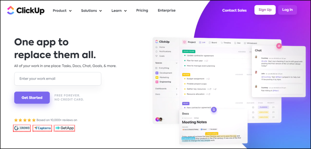
ClickUp is one of the best SaaS website examples, with a stunning design and excellent SEO strength helping it drive thousands of organic visitors.
As a leading project management platform, ClickUp is packed with features allowing its users to manage work, collaborate, track time, and get things done. But with so many features, it can be challenging to prioritize what to show on the homepage.
ClickUp’s design team solved this by using an interactive homepage where the visitors can click different features to see them in action.
ClickUp has dedicated pages for every product feature, calls to action to drive conversions, and a world-class blog that positions it as an authority and helps it rank for valuable search keywords.
SaaS Website #2: Canva
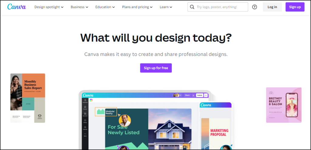
Canva is the world’s leading graphic design tool empowering millions of users worldwide to turn their ideas into reality without technical design skills.
So, it’s fitting that Canva’s website has an innovative and eye-catching homepage design that’s perfectly optimized for SEO and conversions.
I particularly like its navigation menu that features its use cases and core options and immediately helps the user understand what it can do.
Plus, when you scroll down the homepage, it briefly covers the main features using small content snippets optimized for its target keywords.
Overall, it’s an excellent example for SaaS marketers.
SaaS Website #3: Asana
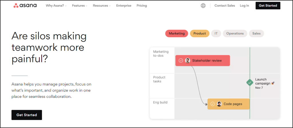
Asana is another leading project management tool with an incredibly engaging website design that instantly communicates its core benefits and gives visitors an inside look at its features. You can click the various design elements to see Asana’s main use cases and get the product’s feel.
The site uses descriptive homepage copy, helping it target the right search keywords and driving organic traffic. In addition, each feature has its dedicated page with more details and better-optimized content.
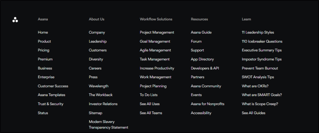
Asana’s design team has made full use of its footer, listing links to its main pages and learning resources from its blog and knowledge base.
SaaS Website #4: Mailchimp
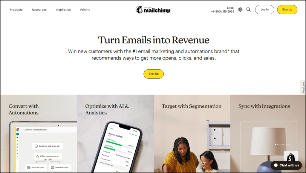
Mailchimp is the world’s leading email marketing automation platform, with millions of users worldwide. It is known for frequently changing and updating its website design with unique and daring experiments.
Its current website design positions it as a complete marketing automation platform with traffic generation, conversion, engagement, and tracking tools.
Mailchimp uses sideways navigation menus that list its core feature pages, knowledge base links, and use cases. It is also among the rare SaaS websites that feature its pricing plans on the homepage.
As you scroll down, its interactive design uses animated GIFs to demonstrate different features along with descriptive content to optimize the page for SEO.
SaaS Website #5: Kajabi

Kajabi is a world-class online learning platform designed to help professionals, experts, and marketers monetize their knowledge through online courses, membership sites, coaching programs, and digital products.
It has a clutter-free homepage design with lots of white spaces and smart use of CTA buttons. Instead of confusing visitors with tons of features, Kajabi uses a simpler approach and lists what it offers at each stage of the info product creation process.
Kajabi’s is also an excellent example of SaaS SEO and content marketing. It not only publishes high-quality informational content but also dominates several comparison keywords [eg. Kajabi vs. Thinkific, Teachable vs. Kajabi, etc.] in the eLearning space, allowing it to attract thousands of search visitors every month.
SaaS Website #6: Typeform
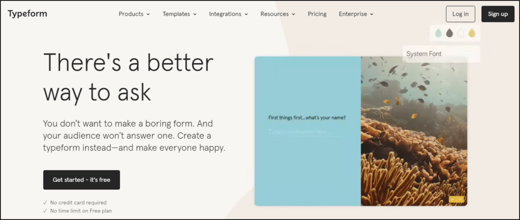
Typeform helps people create beautiful and engaging surveys, quizzes, forms, and polls with a simple drag & drop user interface.
Its website immediately catches your attention with attractive colors and engaging animated GIFs showing how it works.
As you scroll down, it clearly describes how it works and gives you an inside look at its templates and designs. To increase conversions, it dedicates a whole section to testimonials and social proof.
Typeform also has a high-quality blog and a comprehensive resource section that helps its users and allows it to target relevant long-tail keywords to drive search traffic.
SaaS Website #7: Hotjar

Hotjar offers heatmaps, website recordings, and behavioral analytics that provide you with priceless audience insights and help you optimize your website’s user experience.
It’s built for savvy marketers and conversion optimization experts looking but does an excellent job of simplifying its features and communicating its core benefits.
It has an interactive homepage design with descriptive navigation menus and brilliant website copy. As you scroll down the page, it uses a combination of explainer videos and animated GIFs to help you understand what it offers.
In addition, it has one of the best conversion optimization blogs with detailed and actionable content on various relevant topics optimized for its target keywords.
What Can You Learn From The Best SaaS Websites?
There’s a lot to learn from these SaaS website examples.
Notice how they use interactive elements such as clickable menus and animated GIFs to demonstrate their features. In addition, all of them have invested heavily in SaaS content marketing by creating dedicated resources, knowledge base sections, and blogs.
This combination of high-quality content and interactive design helps them attract relevant search traffic and convert it into leads and free trial users.
